> ## Documentation Index
> Fetch the complete documentation index at: https://docs.chatnode.ai/docs/llms.txt
> Use this file to discover all available pages before exploring further.
# Customization
> The Customize tab in ChatNode offers a range of options to personalize the look and functionality of your agent.
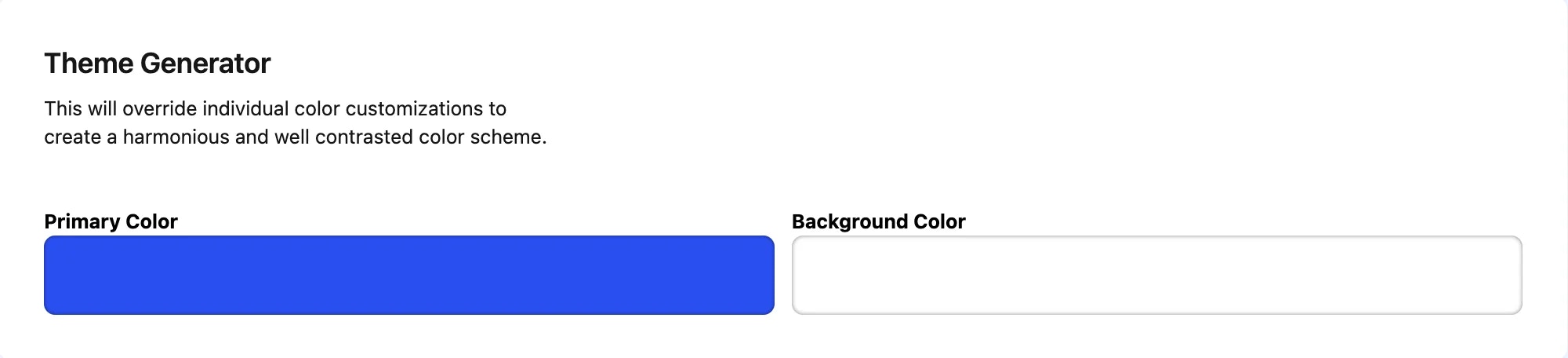
### **1. Theme Generator**
In the **Theme Generator** section, you can set a **Primary Color** and **Background Color** for your agent’s theme. This feature allows you to create a harmonious and well-contrasted color scheme for a visually appealing interface. Note that this will override individual color customizations to ensure consistency across your agent’s design.
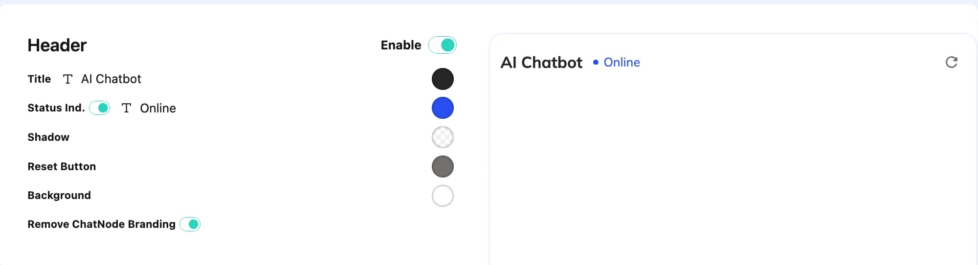
 ### **2. Header Customization**
The **Header** section lets you customize the header of your agent. Here’s what you can adjust:
* **Title**: Modify the display title of the agent (e.g., "AI Agent").
* **Status Indicator**: Show whether the agent is online.
* **Header Color**: Choose a color for the header.
* **Shadow Effect**: Enable or disable a shadow under the header.
* **Reset Button**: Allow users to reset the chat.
* **Remove ChatNode Branding**: Toggle to remove ChatNode’s branding from the chat header.
### **2. Header Customization**
The **Header** section lets you customize the header of your agent. Here’s what you can adjust:
* **Title**: Modify the display title of the agent (e.g., "AI Agent").
* **Status Indicator**: Show whether the agent is online.
* **Header Color**: Choose a color for the header.
* **Shadow Effect**: Enable or disable a shadow under the header.
* **Reset Button**: Allow users to reset the chat.
* **Remove ChatNode Branding**: Toggle to remove ChatNode’s branding from the chat header.
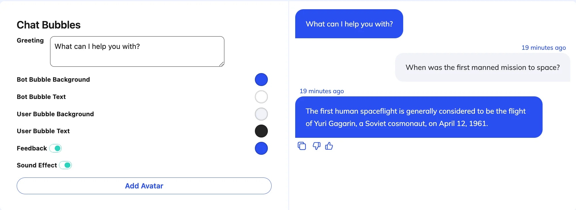
 ### **3. Chat Bubbles**
Under **Chat Bubbles**, you can style the agent and user message bubbles. Customizations include:
* **Greeting**: Set an initial greeting message.
* **Bubble Colors**: Customize background and text colors for both the agent and user message bubbles.
* **Feedback Option**: Enable a feedback feature so users can rate responses.
* **Sound Effect**: Activate sound effects for each message received or sent.
* **Avatar**: Add a personalized avatar for your agent for a more engaging user experience.
### **3. Chat Bubbles**
Under **Chat Bubbles**, you can style the agent and user message bubbles. Customizations include:
* **Greeting**: Set an initial greeting message.
* **Bubble Colors**: Customize background and text colors for both the agent and user message bubbles.
* **Feedback Option**: Enable a feedback feature so users can rate responses.
* **Sound Effect**: Activate sound effects for each message received or sent.
* **Avatar**: Add a personalized avatar for your agent for a more engaging user experience.
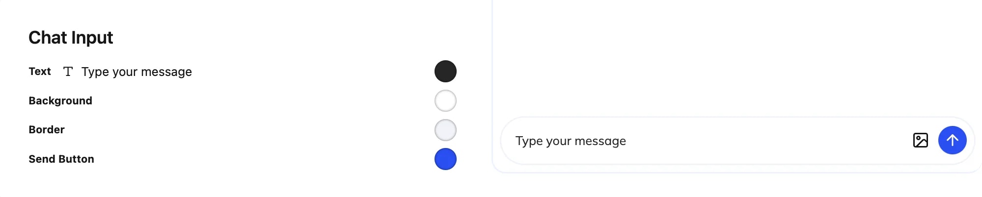
 ### **4. Chat Input**
The **Chat Input** section allows you to customize the text input area where users type their messages:
* **Text**: Modify the placeholder text (e.g., "Type your message").
* **Background and Border**: Adjust the background color and border of the input box.
* **Send Button**: Enable or disable the send button and set its background color.
### **5. Suggested Questions**
### **4. Chat Input**
The **Chat Input** section allows you to customize the text input area where users type their messages:
* **Text**: Modify the placeholder text (e.g., "Type your message").
* **Background and Border**: Adjust the background color and border of the input box.
* **Send Button**: Enable or disable the send button and set its background color.
### **5. Suggested Questions**
 In **Suggested Questions**, you can create quick prompts that users can click on
to start a conversation. This can guide users and improve engagement by
suggesting common questions or topics.
### **6. User Info Collection**
The **User Info** section provides options to collect user details before they start chatting:
* **Collect Name, Email, Phone**: Enable fields to gather user information like name, email, and phone number.
* **Submit Button Text**: Customize the text of the submit button (e.g., "Start Chatting").
In **Suggested Questions**, you can create quick prompts that users can click on
to start a conversation. This can guide users and improve engagement by
suggesting common questions or topics.
### **6. User Info Collection**
The **User Info** section provides options to collect user details before they start chatting:
* **Collect Name, Email, Phone**: Enable fields to gather user information like name, email, and phone number.
* **Submit Button Text**: Customize the text of the submit button (e.g., "Start Chatting").
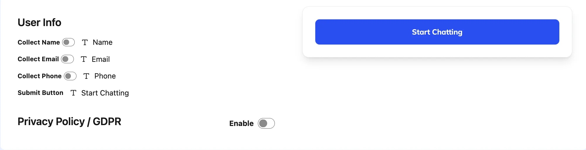 ### **7. Privacy Policy / GDPR**
The **Privacy Policy / GDPR** section helps you comply with privacy laws by adding a checkbox for users to agree to your terms and conditions. You can customize the message to say something like, "I agree with the terms and conditions."
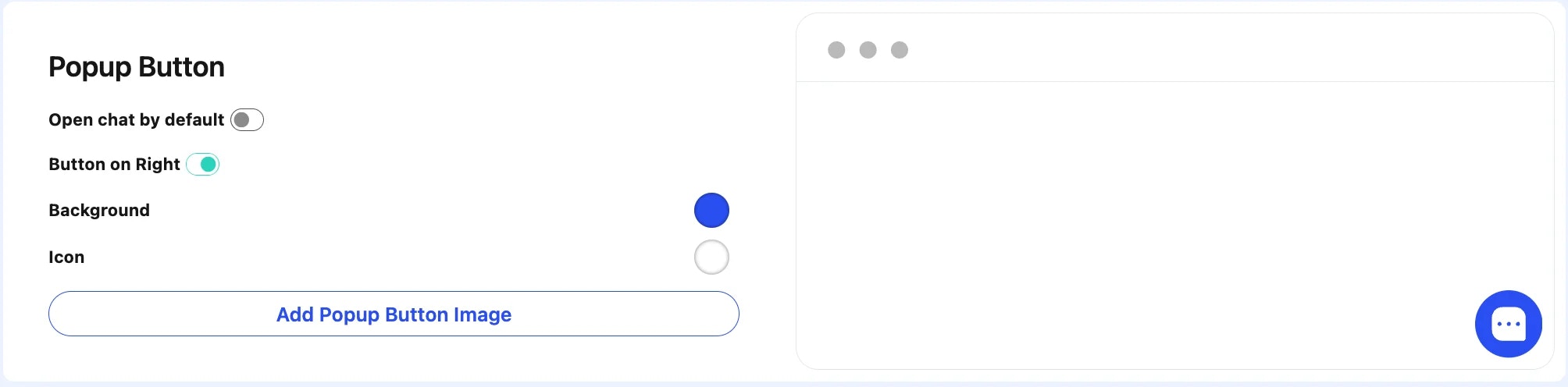
### **8. Popup Button**
The **Popup Button** settings allow you to configure how users access the chat widget on your website:
* **Open Chat by Default**: Decide if the chat opens automatically.
* **Position**: Position the button on the right side of the screen when enabled, or on the left side when disabled.
* **Button Background and Icon**: Customize the background and icon for the popup button.
### **7. Privacy Policy / GDPR**
The **Privacy Policy / GDPR** section helps you comply with privacy laws by adding a checkbox for users to agree to your terms and conditions. You can customize the message to say something like, "I agree with the terms and conditions."
### **8. Popup Button**
The **Popup Button** settings allow you to configure how users access the chat widget on your website:
* **Open Chat by Default**: Decide if the chat opens automatically.
* **Position**: Position the button on the right side of the screen when enabled, or on the left side when disabled.
* **Button Background and Icon**: Customize the background and icon for the popup button.
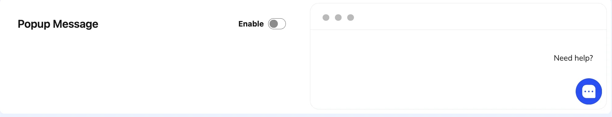
 ### **9. Popup Message**
The **Popup Message** section lets you set an initial message that appears when the chat button is hovered over, prompting users to engage (e.g., "Need help?").
### **9. Popup Message**
The **Popup Message** section lets you set an initial message that appears when the chat button is hovered over, prompting users to engage (e.g., "Need help?").
 ### **Saving Your Customizations**
Once you’ve configured each setting to your preference, don’t forget to click **Save** to apply all changes.
These customization options allow for extensive control over the look and feel
of the agent interface, enabling users to align it with their branding or
personal preferences.
### **Saving Your Customizations**
Once you’ve configured each setting to your preference, don’t forget to click **Save** to apply all changes.
These customization options allow for extensive control over the look and feel
of the agent interface, enabling users to align it with their branding or
personal preferences.